
Internet & TV Order Flow


GOALS
The primary goal of the redesign was to increase the conversion rate for Internet & TV purchases.A second goal: move more customers from hotline and store-based orders to online self-service channels.
This could only succeed if the ordering process became simpler, faster and mobile-optimized.


Context
All business goals were defined by internal stakeholders and tracked using Adobe Analytics. Pain points were uncovered through a combination of quantitative data and qualitative usability testing.
As part of the redesign, the previous Axure-based prototype was replaced by mobile-optimized Figma flows.


METHODS
- Prototyping (Figma)
- Data-driven Design & A/B Testing (Adobe Analytics, Target)
- Interviews & Usability Testings


Swisscom

UX/UI Designer
Learnings
- I learned how valuable interdisciplinary collaboration is for translating complex technical and legal constraints into usable flows.
- I learned that data-informed UX decisions – paired with consistent testing – are the most effective path to meaningful product improvements.


Preview of the redesigned one-page order for Internet & TV

Phase 1: Analyse
UX Strategy & Process
We started from the hypothesis: A better user experience – especially on mobile – will directly increase conversions and online preference.
Approach:
- Replaced outdated flows with modular mobile-first prototypes
- Simplified complex steps and interactions through workshops and iteration
- Continuously validated solutions via user testing and interviews

Phase 2: UI Design
UI Design & Content Improvements
- Bold headlines for visual clarity
- Less boxed UI → lighter layout, easier scanning
- Removed grey backgrounds → cleaner, more modern interface
- Simplified wording → more user-centric and conversational tone
These changes significantly improved mobile readability and engagement.
Before / after:

Phase 3: UX Simplification
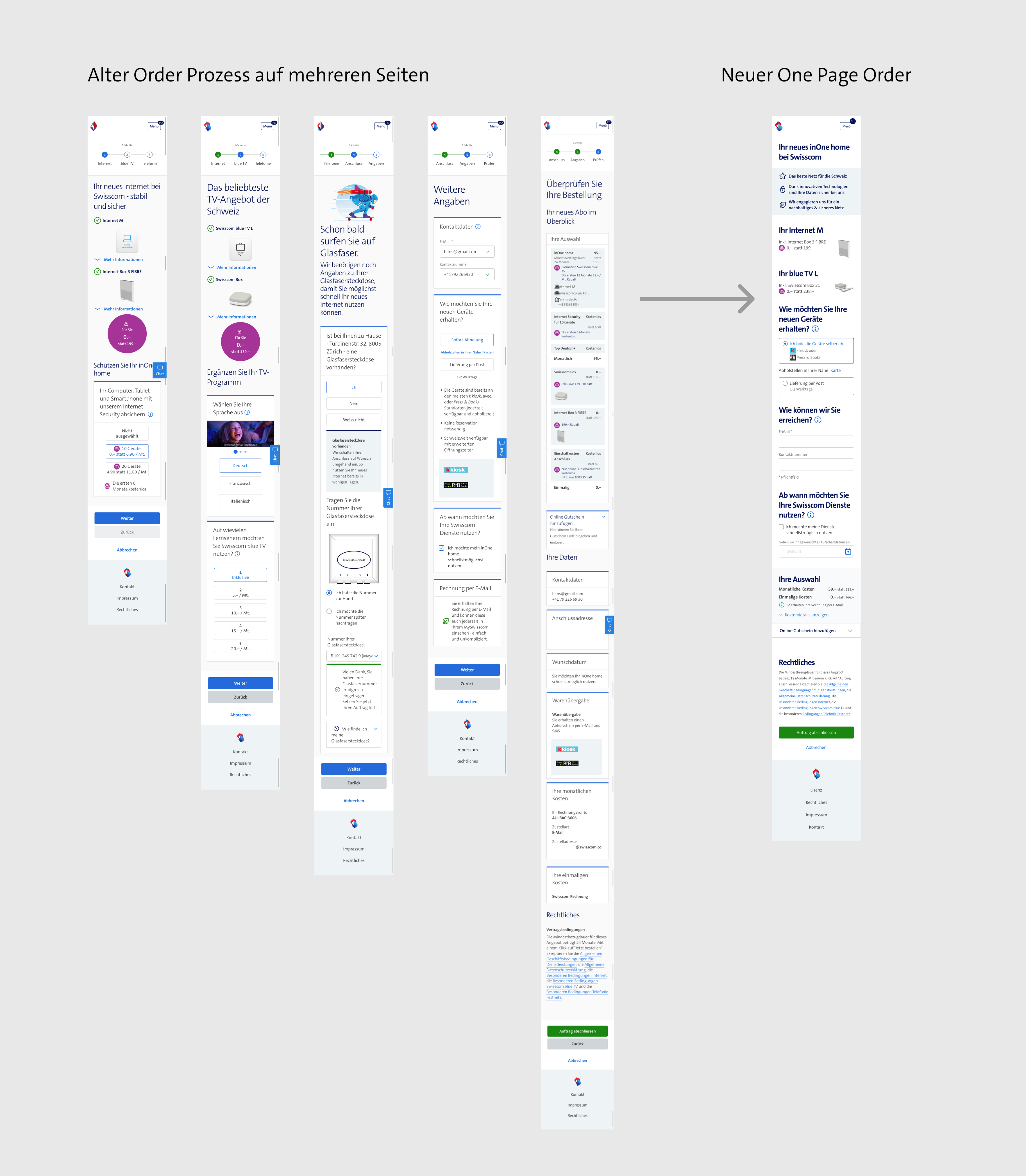
Process Simplification
For the most important use case, first-time customer onboarding, we completely restructured the flow:
- Replaced multiple fragmented pages with a streamlined one-page order flow
- Designed and built the entire UI from scratch
This required close collaboration with Business, Architecture, Development and Legal.

Phase 4: Business Value
Results & Impact
Our UX measures had direct impact on conversion, online share and internal process costs:
- +15% conversion uplift through the UI redesign (Phase 2)
- +30% conversion uplift through simplified process (Phase 3)
- +18% increase in online channel share
- Customer satisfaction improved significantly, reflected in a higher Net Promoter Score (NPS)
NEXT PROJECT

BACK TO MY PROJECTS
HOME
MY STORY
MY PROJECTS
CONTACT ME
Internet & TV Order Flow
GOALS
The primary goal of the redesign was to increase the conversion rate for Internet & TV purchases.A second goal: move more customers from hotline and store-based orders to online self-service channels.
This could only succeed if the ordering process became simpler, faster and mobile-optimized.
Context
All business goals were defined by internal stakeholders and tracked using Adobe Analytics. Pain points were uncovered through a combination of quantitative data and qualitative usability testing.
As part of the redesign, the previous Axure-based prototype was replaced by mobile-optimized Figma flows.
METHODS
- Prototyping (Figma)
- Data-driven Design & A/B Testing (Adobe Analytics, Target)
- Interviews & Usability Testings
Swisscom
UX/UI Designer
Learnings
- I learned how valuable interdisciplinary collaboration is for translating complex technical and legal constraints into usable flows.
- I learned that data-informed UX decisions – paired with consistent testing – are the most effective path to meaningful product improvements.
Preview of the redesigned one-page order for Internet & TV
Phase 1: Analyse
UX Strategy & Process
We started from the hypothesis: A better user experience – especially on mobile – will directly increase conversions and online preference.
Approach:
- Replaced outdated flows with modular mobile-first prototypes
- Simplified complex steps and interactions through workshops and iteration
- Continuously validated solutions via user testing and interviews
Phase 2: UI Design
UI Design & Content Improvements
- Bold headlines for visual clarity
- Less boxed UI → lighter layout, easier scanning
- Removed grey backgrounds → cleaner, more modern interface
- Simplified wording → more user-centric and conversational tone
These changes significantly improved mobile readability and engagement.
Before / after:
Phase 3: UX Simplification
Process Simplification
For the most important use case, first-time customer onboarding, we completely restructured the flow:
- Replaced multiple fragmented pages with a streamlined one-page order flow
- Designed and built the entire UI from scratch
This required close collaboration with Business, Architecture, Development and Legal.
Phase 4: Business Value
Results & Impact
Our UX measures had direct impact on conversion, online share and internal process costs:
- +15% conversion uplift through the UI redesign (Phase 2)
- +30% conversion uplift through simplified process (Phase 3)
- +18% increase in online channel share
- Customer satisfaction improved significantly, reflected in a higher Net Promoter Score (NPS)
BACK TO MY PROJECTS
NEXT PROJECT