
UX Behind
duss.io


GOALS
With this website, I wanted to not only present my UX expertise but make it tangible – as a real UX project. My goal was to create a platform that is both visually compelling and professionally solid, reflecting who I am and how I work.


Context
This project was conceived and executed entirely on my own. My focus: to demonstrate how I work methodically, structure content, and validate design decisions.


METHODS
- Competitor Analysis
- Vision Storyboard
- “How Might We” questions
- Ideation Sketches
- Prototyping
- User Walkthroughs & Feedback-Loops


Self-Initiated Project

UX/UI Designer & Researcher
Learnings
- I learned that great information architecture is more than structure – it grows through real dialogue with users.
- I learned that purposeful storytelling is a powerful tool in UX portfolios to make content meaningful.
- I learned how much iterations, testing, and critical feedback can push a project forward – just like in real product teams.

Phase 1: Research
Competitor Analysis
I analyzed how other UX designers structure their portfolios – focusing on navigation, content depth, and design patterns. My goal: identify best practices while positioning myself with a clear point of difference.

Phase 2: Ideation
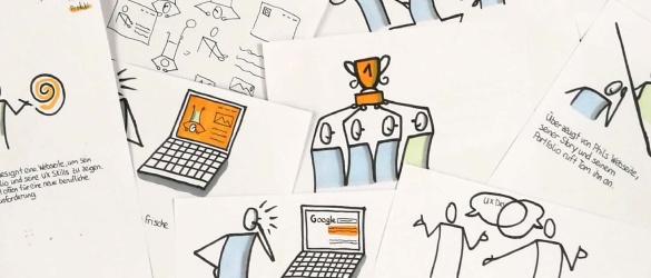
Vision Storyboard
I visualized the core idea of my portfolio as a storyboard – hand-drawn and later digitized. This not only showcases my conceptual thinking but also my ability to communicate complex ideas visually.

Phase 3: Problem Framing
„How Might We“ Questions
To guide the creative process, I crafted HMW questions and developed multiple solution ideas for each. This helped me generate concepts for navigation, content structure, and interaction design.

Phase 4: Concept Sketching
Sketches & Ideation
I used timeboxing to quickly sketch out a range of ideas. This early-stage visualization helped me make user-centered decisions without getting lost in detail.

Phase 5: Structure & Flow
Informations-architeCtur
A clear page structure emerged through several iterations.
I focused on clarity, reduction, and meaningful content prioritization.

Phase 6: Validation
Prototyping & User Tests
I tested the first interactive prototype with multiple users and received valuable feedback:
- Use a homepage instead of starting with the Life Story
- Integrate “Contact” into the main navigation
- Shorten the Life Story (e.g. hobbies, photos)
- Make the footer more purposeful
- Sharpen the focus of project descriptions

Phase 7: Visual Design
HiFi Prototyping in Figma
I refined the optimized concept in Figma to a high-fidelity prototype – with a custom color palette, typography, and UI components. Again, feedback from real users helped guide the process.

Phase 8: Delivery
Implementation in WordPress & Figma Sites
I first built the final prototype in WordPress. However, I was never fully satisfied with the design – compromises were often required.
That’s why I rebuilt the site from the ground up using Figma Sites: pixel-perfect, flexible, and 100% aligned with my UX standards.
BACK TO MY PROJECTS
HOME
MY STORY
MY PROJECTS
CONTACT ME
UX Behind
duss.io
GOALS
With this website, I wanted to not only present my UX expertise but make it tangible – as a real UX project. My goal was to create a platform that is both visually compelling and professionally solid, reflecting who I am and how I work.
Context
This project was conceived and executed entirely on my own. My focus: to demonstrate how I work methodically, structure content, and validate design decisions.
METHODS
- Competitor Analysis
- Vision Storyboard
- “How Might We” questions
- Ideation Sketches
- Prototyping
- User Walkthroughs & Feedback-Loops
Self-Initiated Project
UX/UI Designer & Researcher
Learnings
- I learned that great information architecture is more than structure – it grows through real dialogue with users.
- I learned that purposeful storytelling is a powerful tool in UX portfolios to make content meaningful.
- I learned how much iterations, testing, and critical feedback can push a project forward – just like in real product teams.
Phase 1: Research
Competitor Analysis
I analyzed how other UX designers structure their portfolios – focusing on navigation, content depth, and design patterns. My goal: identify best practices while positioning myself with a clear point of difference.
Phase 2: Ideation
Vision Storyboard
I visualized the core idea of my portfolio as a storyboard – hand-drawn and later digitized. This not only showcases my conceptual thinking but also my ability to communicate complex ideas visually.
Phase 3: Problem Framing
„How Might We“ Questions
To guide the creative process, I crafted HMW questions and developed multiple solution ideas for each. This helped me generate concepts for navigation, content structure, and interaction design.
Phase 4: Concept Sketching
Sketches & Ideation
I used timeboxing to quickly sketch out a range of ideas. This early-stage visualization helped me make user-centered decisions without getting lost in detail.
Phase 5: Structure & Flow
Informations-architeCtur
A clear page structure emerged through several iterations.
I focused on clarity, reduction, and meaningful content prioritization.
Phase 6: Validation
Prototyping & User Tests
I tested the first interactive prototype with multiple users and received valuable feedback:
- Use a homepage instead of starting with the Life Story
- Integrate “Contact” into the main navigation
- Shorten the Life Story (e.g. hobbies, photos)
- Make the footer more purposeful
- Sharpen the focus of project descriptions
Phase 7: Visual Design
HiFi Prototyping in Figma
I refined the optimized concept in Figma to a high-fidelity prototype – with a custom color palette, typography, and UI components. Again, feedback from real users helped guide the process.
Phase 8: Delivery
Implementation in WordPress & Figma Sites
I first built the final prototype in WordPress. However, I was never fully satisfied with the design – compromises were often required.
That’s why I rebuilt the site from the ground up using Figma Sites: pixel-perfect, flexible, and 100% aligned with my UX standards.
BACK TO MY PROJECTS