
Migros
Account


GOALS
The primary goal was to significantly increase user engagement on the Migros Account Dashboard. In addition, the previous tile-based layout was replaced, and the navigation was completely redesigned — with a strong focus on clarity, structure, and a mobile-first approach.


Context
The project goals were defined by the Migros Account Team. UX and UI designs were tested both qualitatively and quantitatively. User behavior was measured using analytics. At the same time, the frontend migrated to a new tech stack based on React.


METHODS
- UX Research (Interviews, Umfragen, Usability Testing)
- Prototyping (Figma)
- Hypothesis-driven testing (e.g., Gamification)
- Analytics evaluation for goal tracking


Migros

UX/UI Designer & Researcher
Learnings
- I learned how much navigation and information architecture affect both user behavior and satisfaction.
- I learned that gamification — when used intentionally and subtly — can truly drive behavior change.

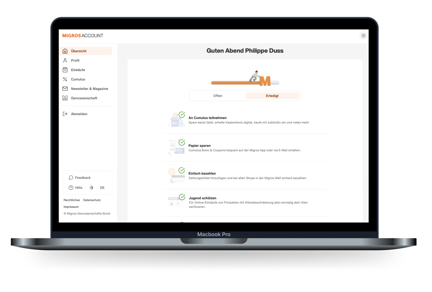
Phase 1: Information-Architecture
Navigation & Structure
Based on qualitative and quantitative user feedback as well as analytics data, I iteratively developed and refined multiple navigation concepts.
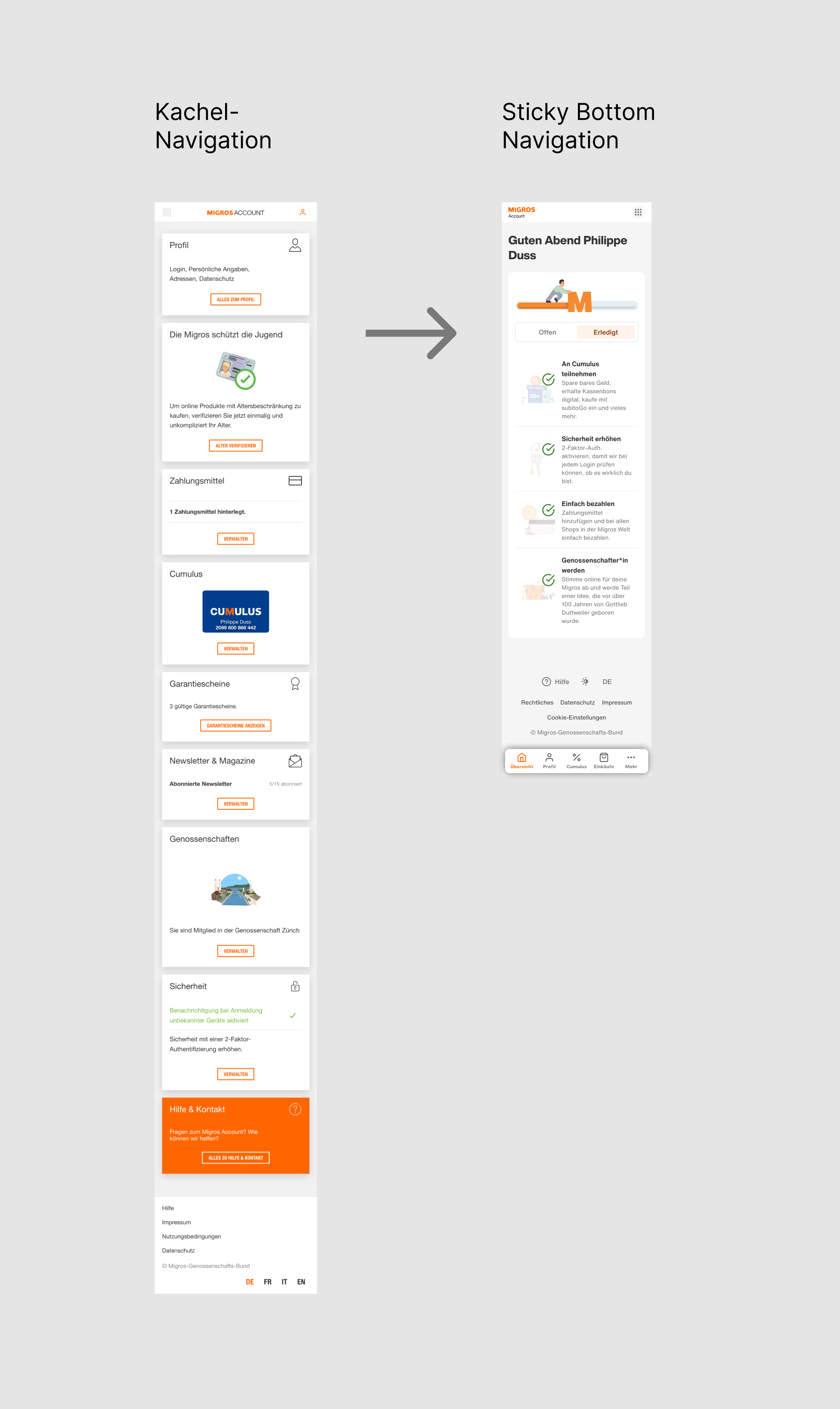

«A dashboard that guides — not overwhelms»

Phase 2: Concept & Innovation
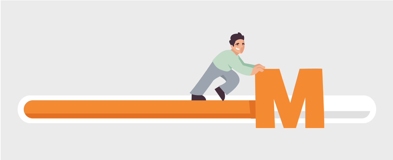
Gamification to Boost Engagement
To drive interaction and increase time on page, we introduced a gamified element: a progress bar that shows users how complete their account setup is — enhanced by motivating microcopy.

«Small nudge, big impact»


Phase 3: Visual Design
UI Redesign
The old dashboard relied heavily on cluttered tile components. The new design brought key improvements:
- Clear visual hierarchy through typography and white space
- Visual separation and structured layout
- Mobile-optimized, accessible components
«From tile chaos to clean design.»

Phase 4: Impact & UX Success
Results
- Users clearly understood the new navigation better
- The progress bar positively influenced interaction and completion rates
- Some dashboard areas saw engagement double
NEXT PROJECT

BACK TO MY PROJECTS
HOME
MY STORY
MY PROJECTS
CONTACT ME
Migros
Account
GOALS
The primary goal was to significantly increase user engagement on the Migros Account Dashboard. In addition, the previous tile-based layout was replaced, and the navigation was completely redesigned — with a strong focus on clarity, structure, and a mobile-first approach.
Context
The project goals were defined by the Migros Account Team. UX and UI designs were tested both qualitatively and quantitatively. User behavior was measured using analytics. At the same time, the frontend migrated to a new tech stack based on React.
METHODS
- UX Research (Interviews, Umfragen, Usability Testing)
- Prototyping (Figma)
- Hypothesis-driven testing (e.g., Gamification)
- Analytics evaluation for goal tracking
Migros
UX/UI Designer & Researcher
Learnings
- I learned how much navigation and information architecture affect both user behavior and satisfaction.
- I learned that gamification — when used intentionally and subtly — can truly drive behavior change.
Phase 1: Information-Architecture
Navigation & Structure
Based on qualitative and quantitative user feedback as well as analytics data, I iteratively developed and refined multiple navigation concepts.
«A dashboard that guides — not overwhelms»
Phase 2: Concept & Innovation
Gamification to Boost Engagement
To drive interaction and increase time on page, we introduced a gamified element: a progress bar that shows users how complete their account setup is — enhanced by motivating microcopy.
«Small nudge, big impact»
Phase 3: Visual Design
UI Redesign
The old dashboard relied heavily on cluttered tile components. The new design brought key improvements:
- Clear visual hierarchy through typography and white space
- Visual separation and structured layout
- Mobile-optimized, accessible components
«From tile chaos to clean design.»
Phase 4: Impact & UX Success
Results
- Users clearly understood the new navigation better
- The progress bar positively influenced interaction and completion rates
- Some dashboard areas saw engagement double
BACK TO MY PROJECTS
NEXT PROJECT